
5.14.25: Revised
 I’m guessing all 49,261 regular subscribers to this blog are sick of estimated pitcher runs allowed.
So let’s (start to) look at estimated batter runs produced!
Baseball Reference and FanGraphs make such an estimation to compute offensive WAR, obviously. But let’s try to come up with something that we can use (not today; down the road a bit) to evaluate how good those measure are, empirically.
Estimating batter runs produced is trickier than estimating pitcher runs allowed. With the latter, we can see something very close to what we are trying to model. The number of runs a pitcher yields is observable. The only adjustment necessary is to partial out team fielding. Then we can set about identifying the elements of pitcher performance that best predict this residual quantity.
But we can’t see anything nearly so proximate to what we are trying to model when we estimate batter runs produced. Seventy-five percent of runs—all but the single ones that correspond to those that batters themselves score when they hit home runs—are the product of multi-player efforts. It’s not obvious how to divide the credit for those.
But we can observe team runs. If we start by identifying the offensive events that predict runs at the team level, we can then try to attribute appropriate shares of runs to players based on their role in generating these types of events.
As I’ve discussed previously, the best predictor of runs at the team level is OPS. While a bit of a statistical mutt, OPS explains a greater share of the variance in team runs scored than does any other single metric, including OPS+ and wOBA. Moreover, nothing we can combine it with it seems to add any more explanatory power (I haven’t written about that yet; I will soon).
Individual batters’ OPSs are observable. So are their personal contributions to “offensive labor,” in the form of the share of team plate appearances that they make.
So one strategy would be to assign to a hitter an estimated number of “season runs produced” equivalent to the number we’d expect his team to score based on the OPS he recorded over the number of plate appearances he made in a season.
 I did this. First, I ran season-by-season regressions for every AL/NL season from 1900 to 2024 to determine the relationship between team OPS and expected runs-per-plate appearance. As expected, the R2s were super high—0.87 across all the seasons. Then, I used that model to compute a “season runs produced” score for every hitter who came to bat in those seasons based on his own number of plate appearances and his OPS.
To validate this approach, I did a spot check that consisted of picking teams out at random and comparing the sum of the estimated “seasons runs produced” for their players both to how many runs those teams were predicted to score by the model and how many they actually did in the season in question.
The numbers were pretty close. E.g., 1984 Detroit Tigers: 816 estimated player runs produced, 816 estimated team runs, 829 actual runs; 1957 Philadelphia Phillies 619, 629, 623; 1932 Chicago Cubs 718, 720, 720.
I could have been more systematic and computed a mean error but my dataset was constructed of different pieces that prevented me from accurately assigning to individual teams the estimated runs produced for batters who played for multiple teams. With a bit more work and patience, I could definitely pull this off. But for present purposes (which might well evolve into an even more satisfactory system), this seemed good enough!
Next I subtracted from each player’s estimated season runs produced the number of expected runs a composite batter with the same number of PAs but with an AL/NL mean OPS would have been expected to generate. The difference corresponds, then, to the runs produced above average—RP_aa—of the player in question.
Now (part of) what you’ve been waiting for: the top 100 highest “run productive” seasons—as measured by runs produced above average—in AL/NL modern history.
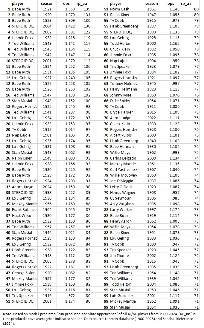 Unsurprisingly, Babe Ruth and Ted Williams dominate, along with Jimmie Foxx, Lou Gehrig and the other usual suspects (and with lying, shameful steroid-enhanced cheaters appropriately erased).
Okay. As you probably know by now, this isn’t a very satisfactory way to proceed. The reason is that the relationship between a metric like runs-produced per PA and the skill it is supposed to be measuring cannot plausibly be expected to be uniform across AL/NL history. Consider:
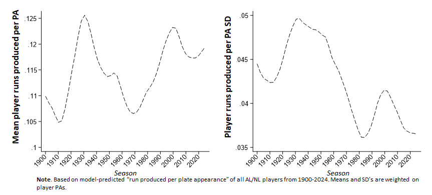
 This sort of variance has nothing to do with changes in the quality of play over time; it has everything to do with skill-unrelated changes in game conditions—the introduction of the “live ball,” improvements in playing surfaces, rule changes and rule violations, the advent of nighttime play—etc. Differences in RP_aa tell us plenty about the performance of players at any given time but are simply not commensurable across stretches of time.
Maybe, too, you realize at this point that the solution to this sort of measurement problem is standardization. We can substitute season-standardized measures of OPS and runs scored and generate a standardized variant of RP_aa that reflects how many more or fewer standard deviations from the season mean a player’s run-production was. By design, this z-score variant of the metric puts performances across all seasons on a common scale.
To make the standardized RP_aa more intuitive, we can assign it a run value. The most logical one is the median RP_aa standard deviation for AL/NL history: when we multiply a player’s RP_aa z-score score by that amount, we get an historical “average number of runs above average” associated with the difference between that player’s OPS and the mean player’s OPS in the season in which he played.
This approach was adapted from the technique pioneered by Michael Schell in his classic studies of individual batting over time. Read them!
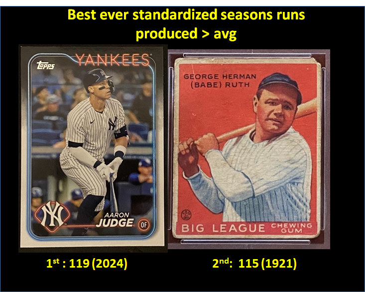
Okay, so now take a look at the 100 best standardized RP_aa seasons of all time:

We see that 2024 Aaron Judge now tops the list. Ruth 1921 is second, and 2022 Aaron Judge is the next highest (non-enhanced) at 8th, after a couple more Ruth seasons. This is comparable to results of a standardized OPS analysis I did after the 2024 season wrapped up—but I like this better because it is uses OPS to generate even more information about the outcome-significance of Judge’s performances (seriously, we are as lucky to be watching him play as those—those of you?—who got to see Ruth).
This re-scaling of RP_aa still isn’t perfect. Standardized season runs-produced above average is a function of OPS and plate appearances. Plate appearances, too, can vary for reasons that are skill unrelated—like changes in the number of games played per season by AL/NL teams. To try to account for this, we could evaluate players based on just a rate statistic—namely, runs-produced above average per plate appearance. But then we’d have to institute some sort of “minimum play” threshold to exclude players who haven’t come to bat often enough to be fairly tested.
But as a compromise, I added SRPaa_100. Reflecting the expected number of standardized runs produced per 100 PAs, this metric allows one to compare players whose season totals might be thought to be unfairly benefitting players who had the advantage of today’s longer schedule.
In general, standardization, though, is going to remove the unfair disadvantage of more recent players, who, like Judge, have had to play in more competitive, lower-variance conditions. Why has the runs-produced-per-plate-appearance SD declined so much (the steroid jolt of the 1990s/early 2000s notwithstanding)? Well, you better ask Stephen Jay Gould about that!
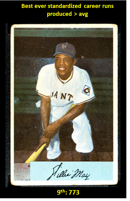
One last bit: career total standard runs produced above average.
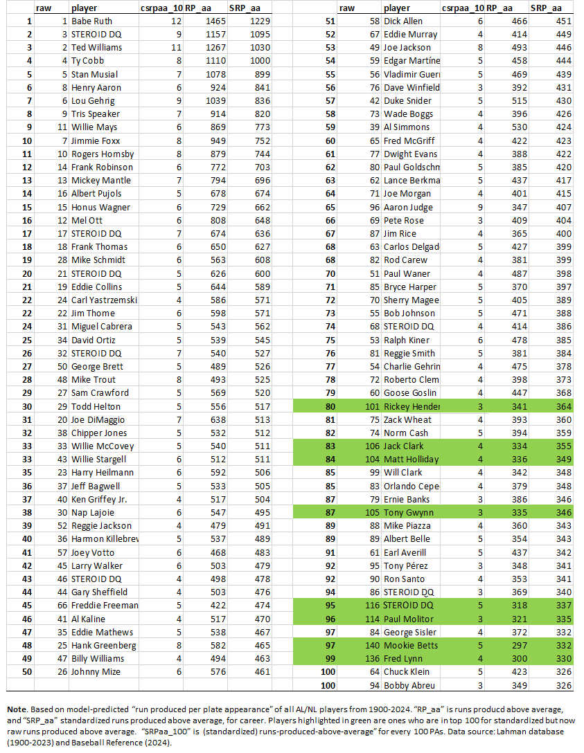
You can decide what inferences to draw. I’ve gone on way too long as it is!
But if you want to go even further on your own, the data are in the library. If you see something worthy of note, by all means tell me—I’m eager to learn as much as I can!

2 Responses
You do wonderful work! But I don’t understand the obsession with disqualifying Barry Bonds and a few other juicers that you randomly chose… Plenty of PED users on this list. On the table on the bottom Number 43 is disqualified and number 44 is Gary Sheffield – who testified he used roids via BALCO. You even have a picture of Mays, who was not only a user but distributor of PEDs (speed). And Ruth played in a league that had a rule where you had to be white. What’s worse!? Line #8 is Tris Speaker, who gleefully used the N-Word and reportedly was KKK or KKK-affiliated. You aren’t the morality police and if you were you’d be fired for hypocrisy!
Hi, Kleg.
I’m glad you are finding value in the site!
I get your perspective on steroids. My own view isn’t so much about morality as it is about the impact of steroids on measurement. As you can see, much of my analysis is aimed at trying to create common scales for assessing performances over time; I want to try to remove influences that are era specific and that therefore render conventional performance metrics incommensurable across different ones. Steroids create the same sort of commensurability challenge but are even harder to adjust for b/c they were used selectively. So my personal choice is just to remove them from the mix; I go back and forth between taking the (reasonably documented) players from the data altogether or keeping them in (on the ground that others’ performances in competing against them should reflect the challenge of that within their era) but then “DQ’ing” them from the comparisons.
But this is just what I do. It makes the enterprise more edifying *for me*. I recognize others might feel differently and have no issue with those who do–certainly no moral one!
In fact, when I post the data for others to analyze, I include all the players, enhanced or otherwise, so that anyone who wants to modify or extend the analyses can do as he or she sees fit. If you have analyses that enter into conversation with mine, I for sure won’t object if you include steroid users in them. Indeed, first line of the code for compiling player run-production scores is “** DQ steroid users–or not, up to you!**”; just chop out the indicated block, and there you go! (Yup, I missed Sheffield & I’m sure some others.)
You make a good point, too, about non-steroid PEDs, such as amphetamines. It’s a judgment call, but I think stimulants have less impact than people, including the athletes who take them, think, and likely even degrade performance if used regularly. In any case, my sense is that they don’t pose the same sort of barrier to measurement comparability that steroids do. Maybe I’m just wrong, though.
But for sure, you are right that if one imposed a morality filter on the analyses, the lists would be mainly sheet after sheet of redactions. No one can seriously believe there is any correlation whatsoever between athletic excellence and excellence of character. I think it’s ridiculous that Curt Schilling isn’t in the HOF. Even more ridiculous that Pete Rose isn’t. Whether any particular player was a moral person is its own discussion–and I have no problem either w/ people who want to engage in that.
If I *were* on the morality police force, I’d welcome being fired. I have a policy against doing any sort of work.